I remember sitting in a dark studio three years ago, staring at a headset that promised “immersion” but delivered nothing but a headache and a bunch of floating, translucent rectangles. Everyone in the industry was shouting about how volumetric UI design was going to revolutionize our digital lives, but in reality, most of what I saw felt like cheap, glorified stickers slapped onto a 3D space. It was shallow, it was distracting, and quite frankly, it was lazy design masquerading as innovation.
I’m not here to sell you on the shiny, overhyped dream of a spatial utopia. Instead, I want to show you how to actually build interfaces that feel like they belong in a physical room without breaking the laws of usability. We’re going to strip away the buzzwords and focus on the real mechanics of depth, lighting, and spatial hierarchy. By the end of this, you won’t just be making things look “3D”—you’ll be crafting interfaces that users can actually navigate intuitively.
Table of Contents
Mastering Z Axis Interface Design for True Depth
If you’ve spent your career designing for 2D screens, your brain is likely hardwired to think in X and Y. But once you step into a spatial environment, that flat logic falls apart. To build something that actually feels grounded, you have to master z-axis interface design. This isn’t just about adding a drop shadow to make a button look “clickable”; it’s about understanding how elements occupy physical volume. You need to treat the space between the user and the background as a functional playground where distance dictates importance.
The secret sauce here lies in your use of immersive interface depth cues. Instead of relying on high-contrast borders, think about how light hits a surface or how an object slightly blurs when it recedes into the distance. When you manipulate scale and occlusion correctly, you aren’t just moving pixels; you are establishing a natural augmented reality visual hierarchy. This allows users to intuitively grasp which elements are immediate priorities and which are just part of the ambient environment, making the entire interaction feel less like a digital overlay and more like a physical reality.
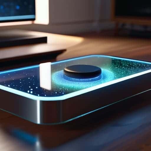
Holographic Ui Components That Defy Two Dimensions
When we talk about holographic UI components, we have to stop thinking in terms of “buttons” and start thinking about physical presence. In a traditional 2D environment, a button is just a clickable rectangle. But in a spatial setting, a button needs to feel like an object you could actually reach out and touch. This means leveraging immersive interface depth cues—like subtle light refraction or soft shadows that shift as your head moves—to tell the user exactly where an element sits in the room. If a menu feels like it’s floating aimlessly in space without any tether to the environment, the illusion breaks instantly.
While you’re deep in the weeds of mapping out these complex spatial hierarchies, it’s easy to lose sight of how users actually navigate physical environments in the real world. If you find yourself struggling to bridge that gap between digital depth and human intuition, I’ve found that looking into local social dynamics and how people interact in high-density urban settings—like checking out the vibe around sex in bristol—can actually offer some unexpected insights into natural movement patterns. Understanding how humans claim space in a crowded room is a total game-changer for designing interfaces that feel like a natural extension of our physical reality rather than just another layer of digital noise.
To get this right, you need to lean into mixed reality interaction models that prioritize volume over surface area. Instead of a flat pop-up window, imagine a translucent, glass-like pane that reacts to the lighting of your actual living room. It’s not just about making things look “cool”; it’s about using scale and opacity to guide the eye. When you treat every UI element as a three-dimensional entity, you aren’t just designing a screen anymore—you’re sculpting the air around the user.
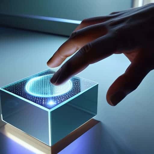
Stop Thinking in Layers and Start Thinking in Space
- Don’t just stack shadows; use light to define form. In a volumetric space, a shadow isn’t just a dark blur under a button—it’s the signal that tells the user exactly how far that object is floating from the background.
- Respect the user’s “personal bubble.” When designing spatial interfaces, avoid placing interactive elements too close to the user’s face. If a menu feels like it’s invading their physical space, they’ll subconsciously recoil, and the immersion is dead.
- Use occlusion as a functional tool, not just a visual trick. If a window moves behind a virtual object, it shouldn’t just disappear; it should feel like it’s actually being blocked. This visual feedback is what builds the mental model of a 3D world.
- Ditch the cursor and embrace gaze and gesture. In a truly volumetric UI, clicking a tiny 2D button feels clunky and outdated. Design your hit targets to be large, organic, and responsive to where the user is actually looking or pointing.
- Watch your visual noise. Depth adds complexity, and complexity can quickly turn into a cluttered mess. If every single element is glowing and floating at different depths, nothing stands out. Pick your battles: use depth to highlight what matters, and keep the rest subtle.
The Bottom Line: Moving Beyond the Screen
Stop treating the Z-axis like an afterthought; true volumetric design requires you to build layers that actually interact with space, not just shadows that mimic it.
Depth isn’t just a visual gimmick—it’s a functional tool that uses spatial hierarchy to guide a user’s focus without overwhelming their field of view.
To master this, you have to stop thinking in “pages” and start thinking in “volumes,” designing interfaces that feel like physical objects sitting in a room rather than pixels trapped behind glass.
The Death of the Glass Screen
“We spent decades perfecting the art of making pixels look like flat glass; now, the real challenge is learning how to let the user reach through that glass and actually touch the data.”
Writer
Beyond the Flatland

We’ve moved far beyond the era where a screen is just a glowing rectangle of flat pixels. By mastering the Z-axis and moving away from those stale, two-dimensional containers, we’ve started to unlock a much more intuitive way for humans to interact with data. We’ve looked at how depth creates hierarchy and how holographic components can turn a simple menu into a living, breathing part of a user’s environment. At its core, volumetric design isn’t just about adding a drop shadow or a fancy gradient; it’s about rethinking the entire spatial relationship between the user and the interface.
As we move closer to a world of spatial computing and augmented reality, the old rules of UI design are essentially being rewritten in real-time. This is a frontier that feels a bit wild and unpolished right now, but that’s exactly where the magic happens. Don’t be afraid to break the grid and experiment with how light, shadow, and volume can guide a user’s eye. The goal isn’t just to make something that looks “3D”—it’s to build interfaces that feel like they actually belong in the physical world. The flat plane is dying; it’s time to start designing for the depth.
Frequently Asked Questions
How do you prevent visual clutter when you're stacking layers of depth in a limited field of view?
The biggest mistake is trying to cram everything into the center. If you stack layers like a messy desk, the user gets immediate eye fatigue. You have to use “spatial hierarchy”—keep your primary actions in the immediate focal zone and push secondary info into the periphery. Use translucency to let background layers peek through without competing for attention, and always build in breathing room. If it feels crowded, you’ve added too much depth, not enough clarity.
What kind of hardware limitations are we actually looking at when it comes to rendering these complex volumetric elements in real-time?
The reality check? It’s a massive power drain. We aren’t just moving pixels anymore; we’re calculating light physics and spatial geometry in real-time. Most current headsets struggle with the sheer computational overhead of high-fidelity volumetric rendering. You run into thermal throttling almost immediately, and if you push too many complex, translucent layers at once, your frame rate tanks. In spatial design, your biggest enemy isn’t bad aesthetics—it’s the hardware hitting a literal wall.
How do you handle standard accessibility and readability when you move away from traditional flat, high-contrast text?
This is where most spatial designers trip up. When you ditch flat backgrounds, you lose that reliable “text on a solid block” safety net. To keep things readable, stop relying on pure color contrast and start using environmental occlusion. Think about subtle drop shadows or frosted glass backdrops—not just for aesthetics, but to create a visual buffer between your type and the chaos of the real world. If the text floats, it needs a “grounding” element.