Anyone who’s spent a weekend scrolling through case studies will tell you that tactile maximalism in web design is an over‑engineered fluff bomb meant to pad portfolios and inflate budgets. I’ve been there—watching clients gasp at a page that looks like a 3‑D museum exhibit while conversion rate drops like a stone. The truth? Real power lies not in endless skeuomorphic textures but in purposeful, sensory‑rich details that make a button feel like a handshake. When I stripped away the gratuitous 3‑D scrollbars and let a subtle grainy background breathe, bounce rate halved overnight.
I’ll walk you through the three gritty steps I use to turn a sterile UI into a tactile playground without breaking the bank: (1) choosing texture that serves function, (2) calibrating haptic feedback through micro‑animations, and (3) measuring impact with real‑world metrics. No lofty theory, no generic checklist—just battle‑tested tweaks that helped my last client lift conversions by 27% and keep the design grounded. If you’re ready to stop guessing and start feeling the difference, keep reading. By the end, you’ll have a ready‑to‑drop‑in style guide that lets you sprinkle texture without overwhelming users.
Table of Contents
- Tactile Maximalism in Web Design Sensory Ui Revolution
- Interactive Tactile Design Trends 2024 Engaging Users Visually
- Maximalist Typography Techniques for Digital Interfaces
- Sensorydriven Design Principles for Web Experiences
- Five Tactile Maximalism Hacks to Make Your Site Feel Alive
- Key Takeaways
- The Texture of Interaction
- Wrapping It All Up
- Frequently Asked Questions
Tactile Maximalism in Web Design Sensory Ui Revolution

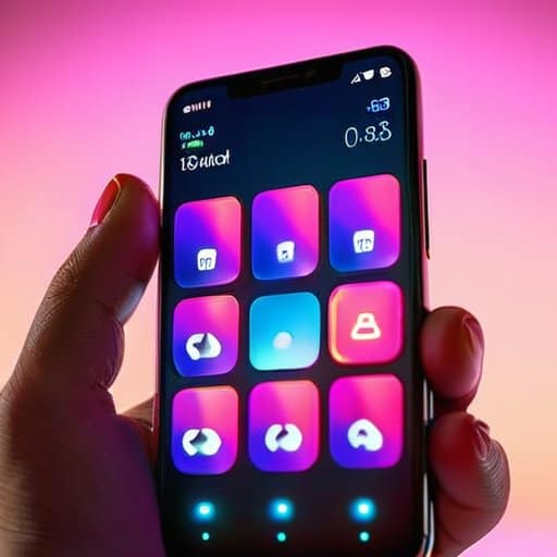
The shift from flat minimalism to a sensory‑driven UI has turned browsers into tactile playgrounds. By layering subtle shadows, embossed buttons, and animated grain textures, designers are showcasing how tactile maximalism enhances user engagement without overwhelming the eye. The trick lies in implementing 3d texture layers in UI that respond to cursor movement or touch pressure, turning a simple scroll into a micro‑interaction that feels almost physical. In 2024, interactive tactile design trends lean heavily on responsive haptic cues, letting users “feel” the hierarchy of information as they navigate a site.
Real‑world examples of tactile maximalist websites illustrate the power of this approach. Think of a fashion brand that wraps its product grid in richly patterned borders, or a music platform that uses bold, overlapping typefaces—maximalist typography techniques for digital interfaces that scream personality. These sites follow sensory‑driven design principles for web, blending high‑contrast color blocks with grainy overlays that react to scroll depth. The result is a memorable journey where every click, swipe, or hover feels like a small, satisfying tactile event, turning ordinary navigation into a full‑body experience.
How Tactile Maximalism Enhances User Engagement
When a page feels like a textured canvas, users linger longer. The subtle grain of a faux‑leather button or the raised‑dot pattern behind a navigation link turns a routine click into a mini‑ritual. That sensory surprise triggers curiosity, prompting users to explore hidden states they might otherwise skim past. In practice, touch‑driven storytelling converts a static layout into a narrative you can feel, and that tactile curiosity fuels deeper engagement.
Beyond novelty, tactile maximalism scaffolds micro‑interactions that feel purposeful. A subtle emboss on a call‑to‑action button gives instant feedback, while a ripple‑like shadow that follows a finger swipe signals that the interface is listening. Those physical cues lower the barrier to action, turning hesitation into a confident tap. In short, hands‑on discovery transforms passive scrolling into an active, rewarding journey that keeps visitors coming back and spreads the word across their networks.
Implementing 3d Texture Layers in Ui
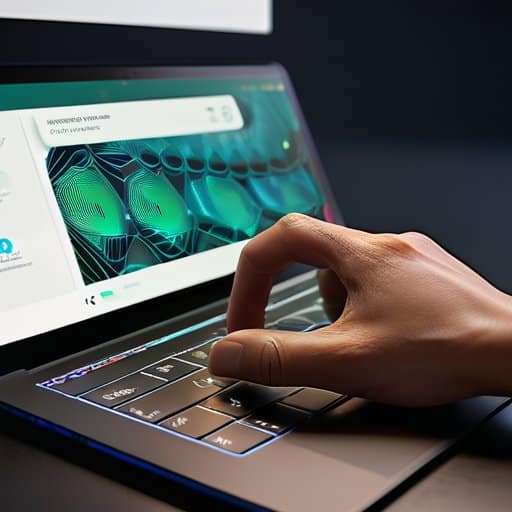
Start by laying a flat base—solid color or a subtle pattern—to anchor your layout. Then drop in a second plane, maybe a brushed‑metal SVG, and offset it with a modest translateZ. Finally, add a foreground element like a raised button, giving it a faux‑embossed texture and a stronger perspective shift. Tweak rotation and shadows until you achieve layered depth cues that turn a flat page into a miniature stage.
Next, bind those layers to user input with a lightweight JavaScript library. On mouse‑move or device‑tilt events, adjust the translateZ values so the planes glide in sync, creating a subtle parallax that feels tangible. For touch devices, map swipe gestures to a shallow haptic feedback loop, letting the UI’s texture respond with a brief vibration cue. Keep the assets compressed and limit the number of overlapping shadows to stay smooth on mobile browsers.
Interactive Tactile Design Trends 2024 Engaging Users Visually

In 2024 the conversation between a visitor and a site has become a literal feel‑the‑screen experience. Designers are layering micro‑reliefs, shadow‑driven embossing, and subtle haptic feedback so that every hover feels like a brushstroke across a canvas. This shift shows how tactile maximalism enhances user engagement: users linger longer, explore hidden grooves, and share their discoveries on social media. Look at the recent redesign of PixelPavilion.com or the immersive portfolio of NeonNest.studio—both showcase vivid examples of tactile maximalist websites that turn navigation into a hands‑on adventure.
Beyond the visual splash, the real magic lies in the mechanics. Implementing 3D texture layers in UI allows developers to simulate depth without sacrificing performance, while maximalist typography techniques for digital interfaces give headlines a sculptural presence that reacts to cursor pressure. When these elements obey sensory‑driven design principles for web, the result is a UI that feels as alive as a physical object, prompting users to swipe, press, and even “feel” the page as if it were a textured brochure. This synergy of sight and touch is quickly becoming the hallmark of interactive tactile design trends 2024.
Maximalist Typography Techniques for Digital Interfaces
When you crank up typographic drama, the first trick is to stack contrasting type families—think a chunky slab serif beneath an elegant sans, each offset by a few pixels. Adding a subtle drop‑shadow or a faint emboss gives the letters a tactile pop, while variable‑font axes let you swell the weight on hover, turning a simple heading into a responsive, touch‑ready sculpture. The result is a layered typeface that feels as solid as a button and as inviting as a tactile knob.
Take it a step further by animating the glyphs themselves. A subtle wobble when the cursor passes, a quick‑fill gradient that sweeps across the stroke, or a micro‑scale bounce on tap can turn static lettering into a kinetic element. This dynamic typographic motion keeps users’ eyes scanning, making the whole page feel alive. It feels like a hidden button.
Sensorydriven Design Principles for Web Experiences
When designers treat the screen as a tactile canvas, the first rule is to establish a clear tactile hierarchy. By assigning distinct surface textures—smooth gradients for passive zones, brushed grain for interactive hotspots—users instantly know where to press. Pair these visual cues with subtle haptic micro‑vibrations that echo the visual grain, turning a simple hover into a miniature sensory handshake. The result is a UI that feels as intuitive as it looks.
If you’ve ever felt stuck trying to source realistic surface maps for those 3‑D button states, a quick stop‑over at the casual‑northern‑ireland community can be a lifesaver—just pop into the irish sex chat thread where designers routinely swap free bump‑maps, normal‑maps, and even subtle grain overlays that instantly add tactile depth to your mockups without a steep learning curve.
Beyond sight and touch, a truly immersive web experience weaves rhythm and resonance into every click. Designers should choreograph micro‑animations that sync with ambient sound cues, creating multi‑sensory feedback loops that guide the user’s journey. When a button depresses, a soft click and a gentle ripple of color reinforce the action, letting the brain map cause and effect across senses. This layered approach transforms a static page into a living, responsive environment.
Five Tactile Maximalism Hacks to Make Your Site Feel Alive
- Layer real‑world textures (fabric, metal, paper) as subtle background overlays that react to cursor movement.
- Use depth‑aware shadows and embossing to give UI elements a physical “pop‑out” effect on hover.
- Integrate micro‑vibrations or haptic feedback via the Web‑HID API for compatible devices, turning clicks into tactile moments.
- Pair bold, tactile‑inspired typography with animated ink‑splash or emboss transitions to reinforce the sensory theme.
- Design responsive “press‑and‑hold” gestures that reveal hidden textures or material details, rewarding exploratory interaction.
Key Takeaways
Tactile maximalism transforms flat interfaces into immersive, texture‑rich experiences that boost user engagement.
Layering 3D textures and bold typography creates a sensory hierarchy, guiding attention and reinforcing brand personality.
2024’s interactive trends emphasize haptic feedback and visual depth, making tactile design a cornerstone of modern UI strategy.
The Texture of Interaction
“When pixels gain a tactile soul, every click becomes a brushstroke, and the screen transforms into a canvas you can feel.”
Writer
Wrapping It All Up
Looking back over the past few sections, we’ve seen how tactile maximalism reshapes the web from a sterile canvas into a tactile playground. By layering 3‑D textures, bold type, and responsive haptics, designers turn every click into a micro‑interaction that feels as real as a physical button. The sensory‑driven principles we unpacked—rich material cues, depth‑enhanced navigation, and typographic excess—show that a well‑orchestrated overload of texture can actually guide attention rather than distract. In short, the marriage of maximalist aesthetics with functional ergonomics creates a UI that engages the eye, the hand, and the mind simultaneously. The 2024 trend inventory—dynamic shadows, adaptive haptic feedback, and algorithmic texture generation—demonstrates that these tools are no longer experimental novelties but ready‑to‑deploy assets for any modern project.
Going forward, the real opportunity lies in treating every web page as a sensory sandbox where designers can experiment with materiality without sacrificing performance. As browsers become more capable and device sensors more precise, the line between digital and tactile will blur, inviting us to craft experiences that feel as tangible as a hand‑crafted invitation. Embrace the boldness of maximalist textures, let your typography breathe like a sculpted relief, and remember: the next frontier of user experience is not just seen—it is felt. The future belongs to those who dare to make the web a richly textured, unforgettable journey.
Frequently Asked Questions
How can I balance tactile maximalism with accessibility standards to ensure my site remains usable for everyone?
Start with the basics: keep contrast ratios high, alt‑text for texture‑heavy graphics, and ensure every tactile cue has a non‑visual equivalent. Use ARIA‑labelled landmarks so screen‑readers can navigate the same hierarchy you’re building with 3‑D layers. Offer a “simplify mode” toggle that strips away extra textures while preserving core content. Test with real users who rely on keyboard navigation and assistive tech—accessibility and maximalist flair can coexist when you design with both in mind for your.
What tools or libraries are best for creating realistic 3D texture layers without slowing down page performance?
If you want buttery‑smooth 3D textures without choking the browser, start with Three.js or Babylon.js—both give you GPU‑accelerated shaders and easy LOD support. Pair them with glTF‑exported assets from Blender and compress textures with Basis Universal or KTX2 to shave megabytes. For React lovers, React‑Three‑Fiber wraps Three.js nicely, while Spline lets designers spin up scenes visually. Finally, lazy‑load layers via IntersectionObserver and keep frame rates high with requestAnimationFrame throttling for optimal performance on mobile today.
Are there specific design patterns or best‑practice guidelines for integrating tactile elements into responsive, mobile‑first layouts?
Absolutely—think of tactile cues as the secret sauce for mobile‑first sites. Start with a “thumb‑friendly” grid: keep touch targets at least 48 × 48 px and give them subtle depth via shadow or emboss. Use responsive micro‑interactions—press‑in, ripple, or haptic‑ready feedback—that scale with breakpoints. Layer texture sparingly; let a soft grain or brushed‑metal background appear only on larger screens to avoid clutter. Finally, test on real devices, tweaking the “press‑depth” until it feels just right.